Brand Identity · Print Design · Marketing Collateral · Visual Communication
I developed a cohesive visual identity and print materials for Aspen Ridge, creating branded collateral that reflects the company's outdoor-focused services and professional approach.
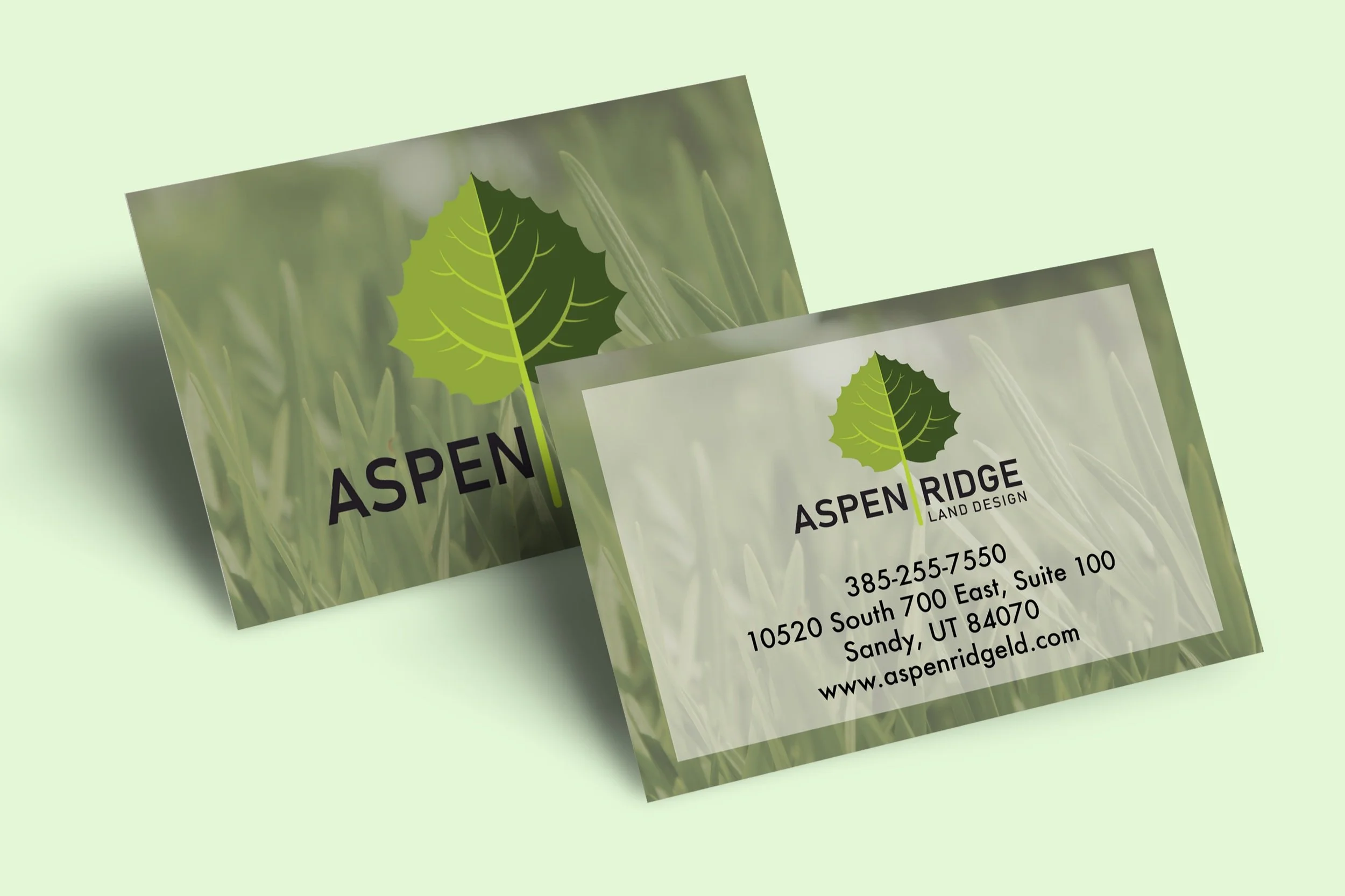
The project included a brochure and business cards designed to work together as a unified brand system, balancing a natural, approachable aesthetic with a polished and professional presentation.
Aspen Ridge
The Challenge
Aspen Ridge needed branded materials that could communicate its services clearly while establishing a visual identity that felt connected to its outdoor-focused business.
The challenge was to create a design system that felt professional and credible without losing the natural character of the brand, while ensuring that multiple printed materials felt consistent and recognizable.
The Approach
I developed a visual system centered around clean typography, natural color choices, and consistent graphic elements that could be carried across different pieces of marketing collateral.
The brochure was structured to communicate the company's services in a clear and organized way, while the business cards extended the same visual language into a more personal point of contact.
The result is a cohesive set of materials designed to strengthen brand recognition and present Aspen Ridge in a polished, professional way.